Exploring the Alluring World of Typographic Landscape
In the realm of design, where creativity intertwines with precision, the concept of a typographic landscape emerges as a captivating fusion. It’s more than just arranging letters on a page; it’s about crafting visual narratives, evoking emotions, and building immersive experiences through the strategic use of type. The typographic landscape transcends the functional role of text, transforming it into an art form that shapes perception and dictates the flow of information. This exploration delves into the nuances of typographic landscapes, uncovering its significance in various design disciplines and its power to communicate beyond words.
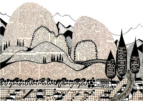
What is a Typographic Landscape?
A typographic landscape, at its core, is the arrangement of typefaces, sizes, weights, and spacing to create a visually engaging and communicative composition. It’s about using typography not just to convey information, but to create a visual hierarchy, establish a mood, and guide the viewer’s eye through the design. Imagine a cityscape constructed entirely from letters, each building represented by a different font, size, or weight. This is the essence of a typographic landscape.
Unlike traditional typography, which focuses primarily on readability and clarity, a typographic landscape prioritizes visual impact and artistic expression. It’s about pushing the boundaries of typography, exploring unconventional arrangements, and experimenting with different styles to create a unique and memorable experience. Think of it as painting with letters, using the nuances of typography to create a rich and textured visual world.
The Elements of a Typographic Landscape
Several key elements contribute to the creation of a compelling typographic landscape:
- Typeface Selection: Choosing the right typeface is crucial. Different typefaces evoke different emotions and associations. A serif typeface might convey a sense of tradition and authority, while a sans-serif typeface might feel more modern and approachable. The choice of typeface should align with the overall message and aesthetic of the design.
- Hierarchy: Establishing a clear visual hierarchy is essential for guiding the viewer’s eye through the typographic landscape. This can be achieved through variations in size, weight, and color. The most important elements should be the most prominent, while secondary elements should be less visually dominant.
- Spacing: Kerning, tracking, and leading play a significant role in the overall readability and visual appeal of a typographic landscape. Careful attention to spacing can create a sense of harmony and balance, while improper spacing can lead to visual clutter and confusion.
- Color: Color can be used to add depth, dimension, and visual interest to a typographic landscape. Different colors evoke different emotions and associations, so it’s important to choose colors that align with the overall message and aesthetic of the design.
- Texture: Texture can be created through the use of different typefaces, weights, and styles. It can also be achieved through the use of visual elements such as lines, shapes, and patterns. Texture adds depth and complexity to the typographic landscape, making it more visually engaging.
Applications of Typographic Landscape
The principles of typographic landscape can be applied to a wide range of design disciplines, including:
Web Design
In web design, typographic landscapes can be used to create visually engaging and user-friendly websites. By carefully selecting typefaces, establishing a clear visual hierarchy, and paying attention to spacing and color, designers can create websites that are both aesthetically pleasing and easy to navigate. [See also: Web Typography Best Practices] The use of responsive typography, which adapts to different screen sizes, is also crucial for ensuring a consistent and optimal user experience across all devices. A well-designed typographic landscape can significantly enhance the user experience and improve the overall effectiveness of a website.
Print Design
Print design offers a unique canvas for exploring the possibilities of typographic landscape. From magazine layouts to book covers, typography plays a crucial role in attracting attention and conveying information. Designers can experiment with different typefaces, sizes, and arrangements to create visually stunning and impactful designs. The use of tactile elements, such as embossing and debossing, can further enhance the sensory experience of the typographic landscape.
Branding
A strong brand identity relies heavily on effective typography. The choice of typeface, color palette, and overall typographic style can communicate a brand’s personality, values, and target audience. A well-crafted typographic landscape can help a brand stand out from the competition and create a lasting impression on its customers. Consistency in typographic style across all brand materials is essential for building brand recognition and reinforcing the brand’s message.
Environmental Design
Typographic landscapes can also be used in environmental design to create visually engaging and informative spaces. Signage, wayfinding systems, and environmental graphics can all benefit from the strategic use of typography. By carefully considering the scale, placement, and visibility of typography, designers can create spaces that are both functional and aesthetically pleasing. [See also: Wayfinding Design Principles] The use of large-scale typography can transform a space into a dynamic and immersive environment.
The Power of Visual Communication through Typography
The typographic landscape is more than just an aesthetic exercise; it’s a powerful tool for visual communication. By understanding the nuances of typography and applying the principles of design, designers can create compositions that effectively convey information, evoke emotions, and shape perceptions. The strategic use of typography can enhance the readability of text, improve the user experience, and create a lasting impression on the viewer.
A well-designed typographic landscape can transform a mundane message into a compelling visual narrative. It can add depth, dimension, and personality to a design, making it more engaging and memorable. By carefully considering the context, audience, and message, designers can create typographic landscapes that are both visually stunning and highly effective.
The Future of Typographic Landscape
As technology continues to evolve, the possibilities for typographic landscape are constantly expanding. New tools and techniques are emerging, allowing designers to create more complex and dynamic compositions. The rise of virtual reality and augmented reality is also creating new opportunities for exploring the potential of typographic landscapes in immersive environments. The future of typographic landscape is bright, with endless possibilities for creativity and innovation.
The increasing accessibility of design software and resources is also empowering more people to experiment with typography and create their own unique typographic landscapes. This democratization of design is fostering a new wave of creativity and innovation, pushing the boundaries of what’s possible with typography. As more designers embrace the principles of typographic landscape, we can expect to see even more visually stunning and impactful designs in the years to come.
Conclusion
The typographic landscape is a powerful and versatile design technique that can be used to create visually engaging and communicative compositions. By understanding the elements of typographic landscape and applying the principles of design, designers can create works that are both aesthetically pleasing and highly effective. From web design to print design to branding, the possibilities for typographic landscape are endless. As technology continues to evolve, we can expect to see even more innovative and creative applications of this dynamic design approach. The art of typographic landscape is here to stay, and its influence will only continue to grow in the world of design. Embracing typographic landscape allows designers to tell stories, evoke emotions, and build immersive experiences, all through the power of carefully crafted typography.
